When running a website for a business, whether a well-established pillar or a budding entrepreneurial venture, the usual concern is maintaining its relevance and competitiveness.
As web design is as diverse as a well-aged tree with deep roots, it has a lot of organic elements working together to keep it alive. This blog can guide you in understanding all these branches to improve your web design chops.
The end goal is to get to grips with easy steps you can take to upgrade your website by combining excellent user experience (UX) with outstanding design that makes your brand shine.
How to Improve Your Web Design

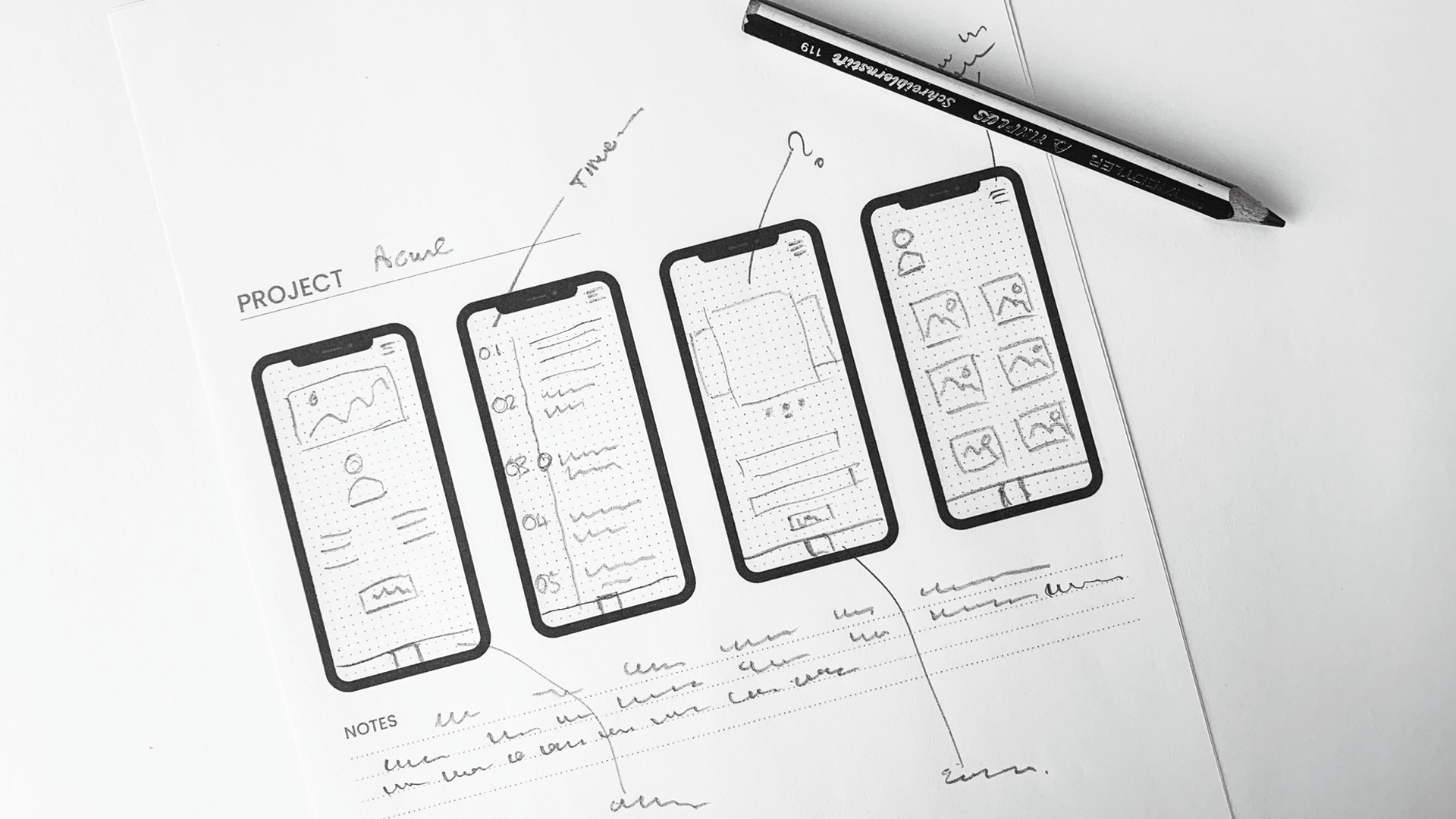
Map out a draft.
Goal – an objective that you’d like your website to accomplish. Consult your business plan and keep your website goals aligned with it.
Site Map – as your website will have multiple pages and branches, you’ll need a directory to make things easier for both the designers and users. These likely include your homepage, blog, gallery, and other functional features you come up with.
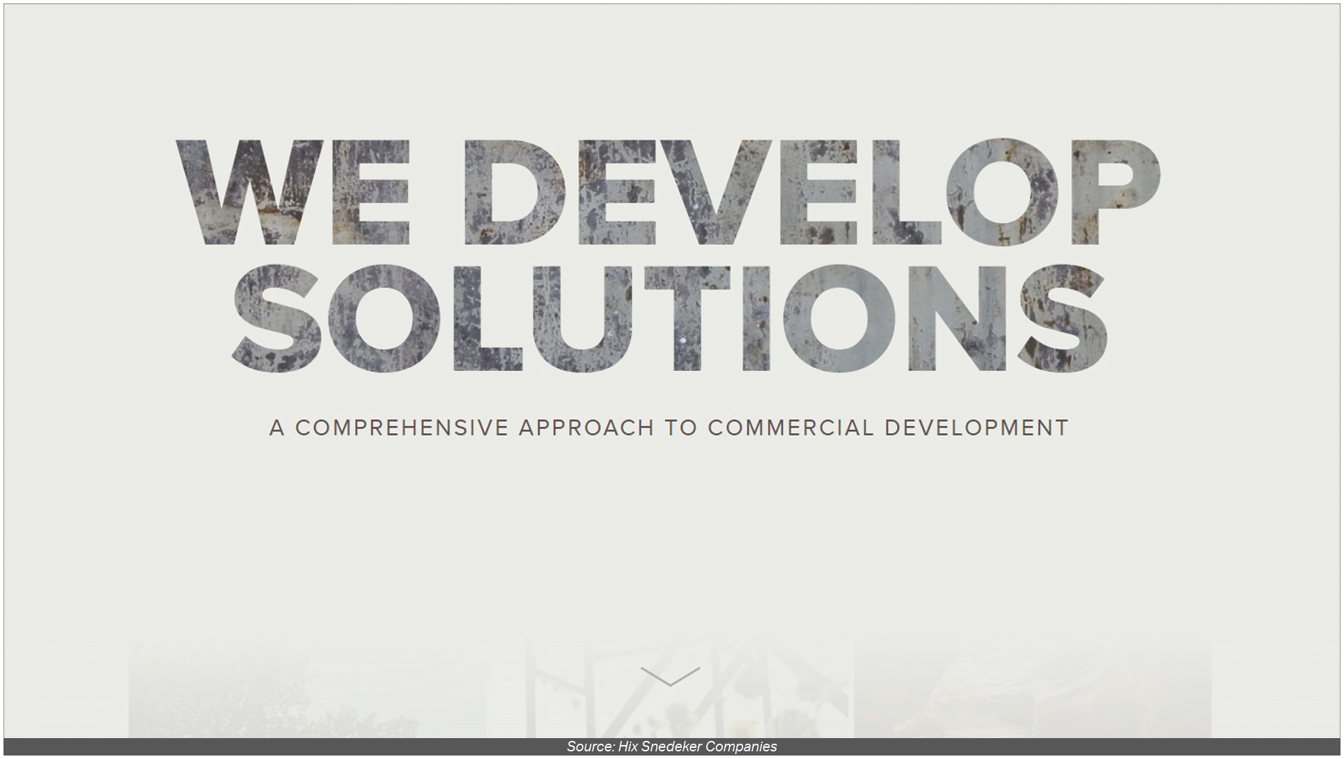
Aesthetic – as much as web design leans more on the technical, it still puts a premium on aesthetics. What color palette suits your theme? Which fonts look more professional? How much white space would the design have? Design aesthetics are important to make your website not only organized but also easy on the eyes which keeps your visitors interested.
Navigation – plan out how each process goes through your website. Each flow should be easy enough to maneuver around even for newcomers and are uncomplicated.
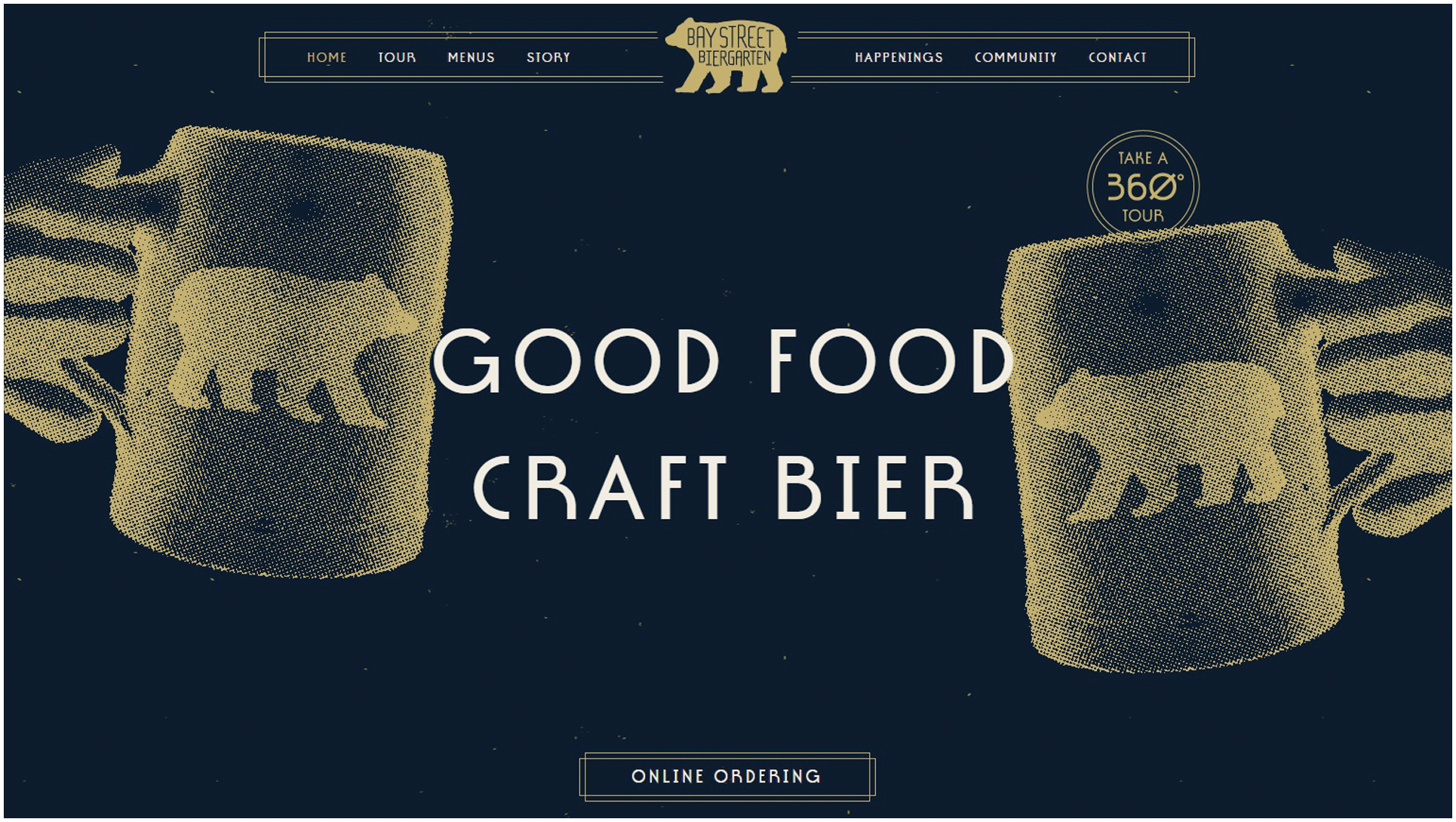
Maintain consistent and clear branding.
Logo and icons – The logos and icons you choose to associate with your brand name should have a lasting impression to be effective. Therefore, you need a design that’s easy to associate with your particular business to make it easier to stick. You can also go on the creative route and make (or have someone make) a design that’s unique to you which is a quick way to generate interest and curiosity
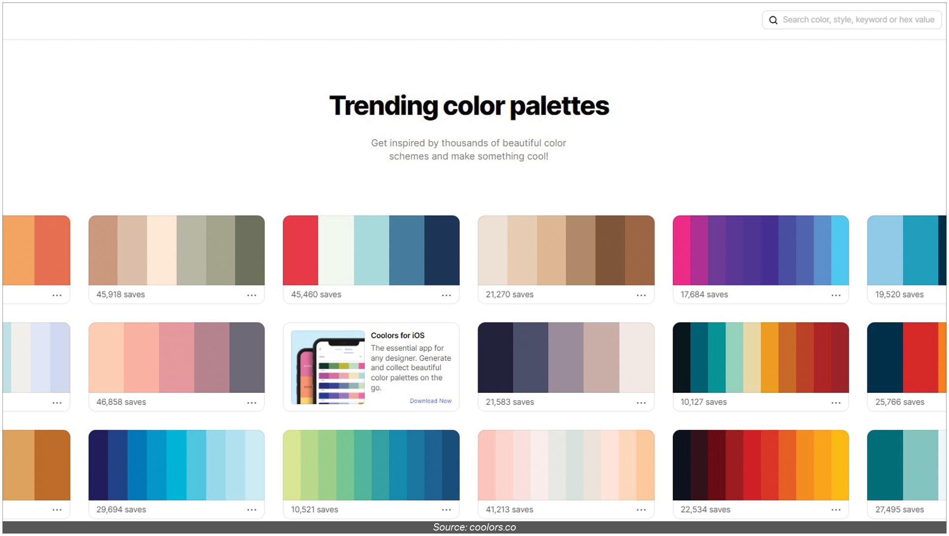
Color palette – Mixing and coordinating colors to set up a mood for your website is another item to consider. Creating an atmosphere adds to the experience when users visit your website. Applying color association can also work in your favor such as when you use red to insinuate passion or orange for a hip vibe.
Typography – Decorative fonts can imply a fun and relaxed environment that caters to a younger market. Serif and Sans Serif fonts set the mood for a more professional vibe on the page. Use these to your advantage in creating clear branding.
Remove clutter.
Choose the Best Structure.
Top-bottom – arranging the site content from general topics that branches out to more specific categories.
Bottom-up – focuses on displaying available content which is the opposite of the top-bottom approach.
Hierarchical Model
Sequential Model
Matrix Model
Database Mode
Exhibit social validation
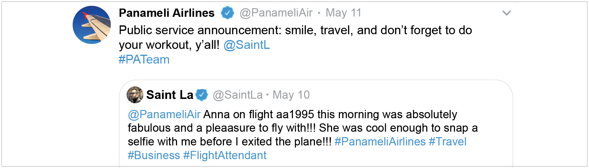
Attach photos with each kudos.
Embed the actual social media post where you were mentioned.
Include video reviews for a more interactive experience.
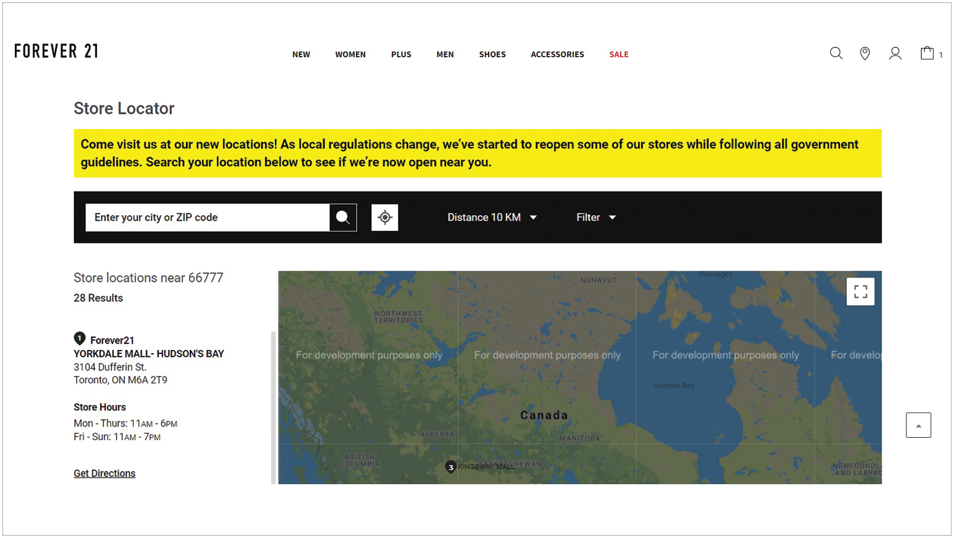
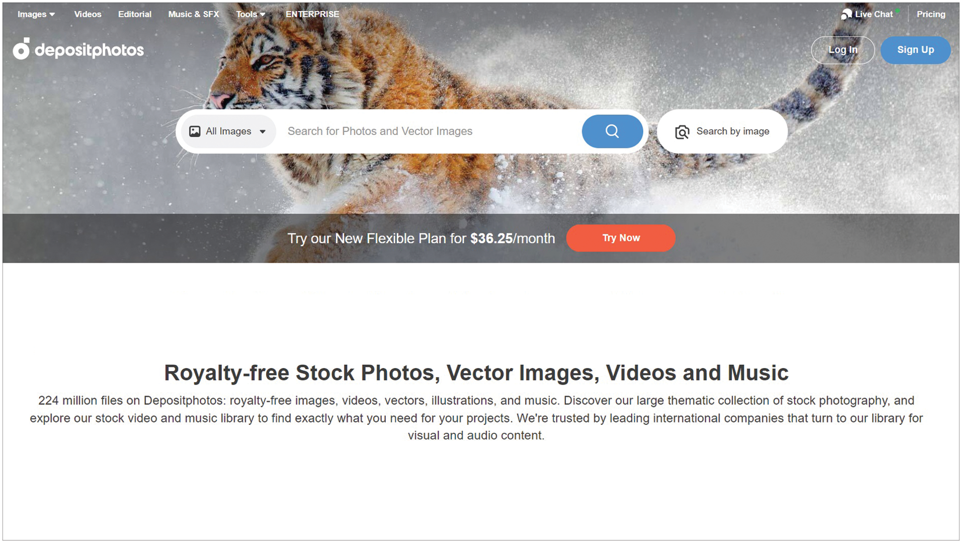
SEO-proof your website.
Homepage
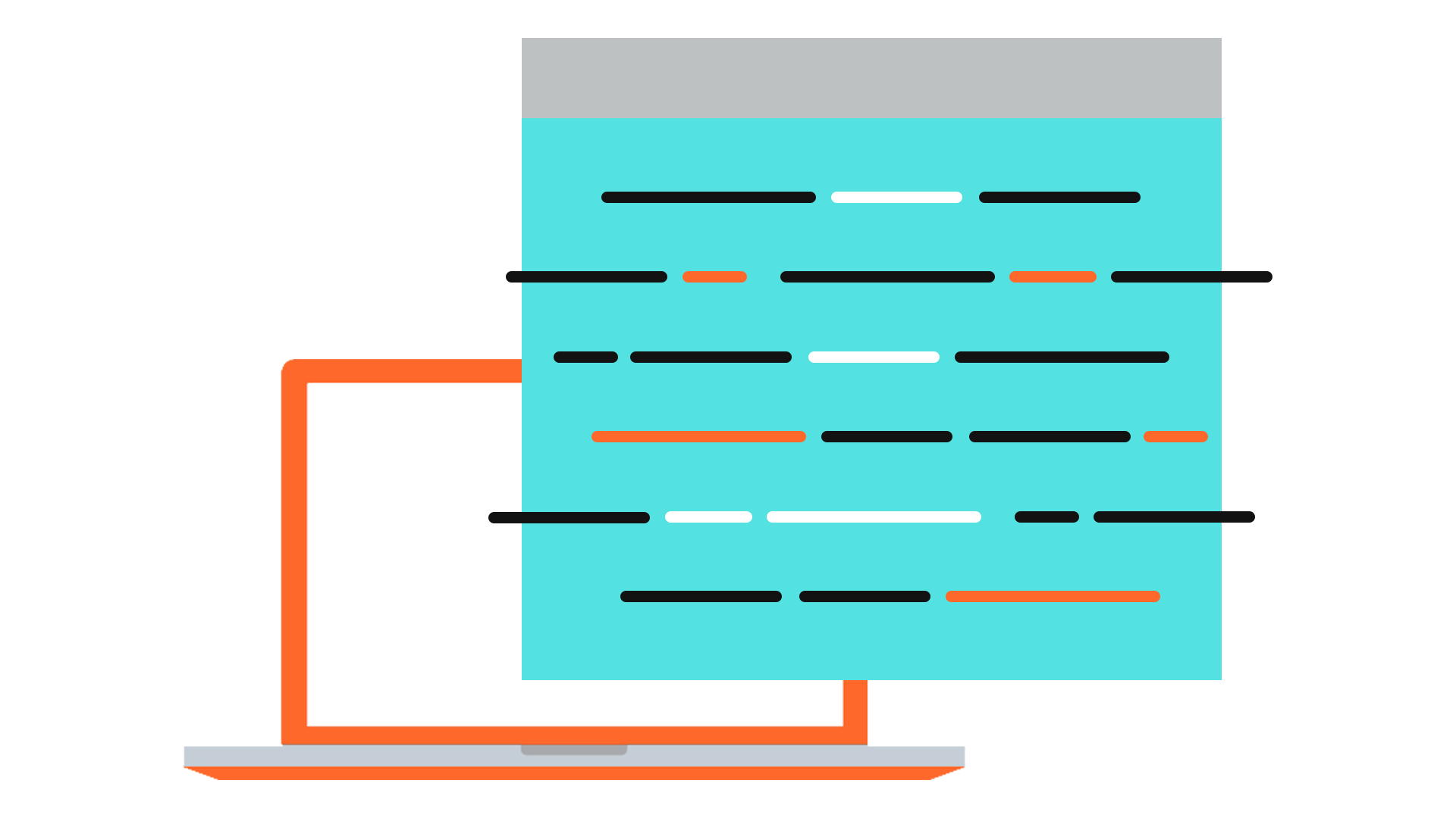
A visually appealing page – clear of clutter while making use of white space and scrolling page that has organized content.
Add alt tags to the images you embed on the website.
Texts
Clear out bugs and errors.
Add useful features.
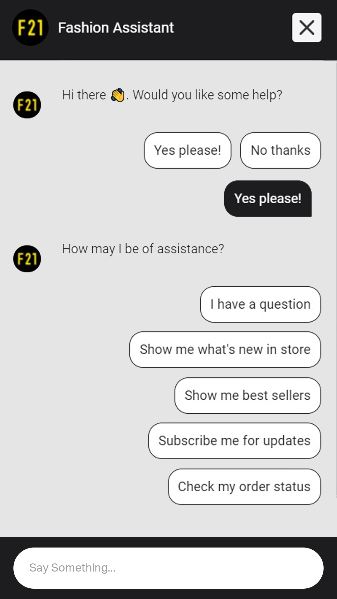
Messaging and chat apps
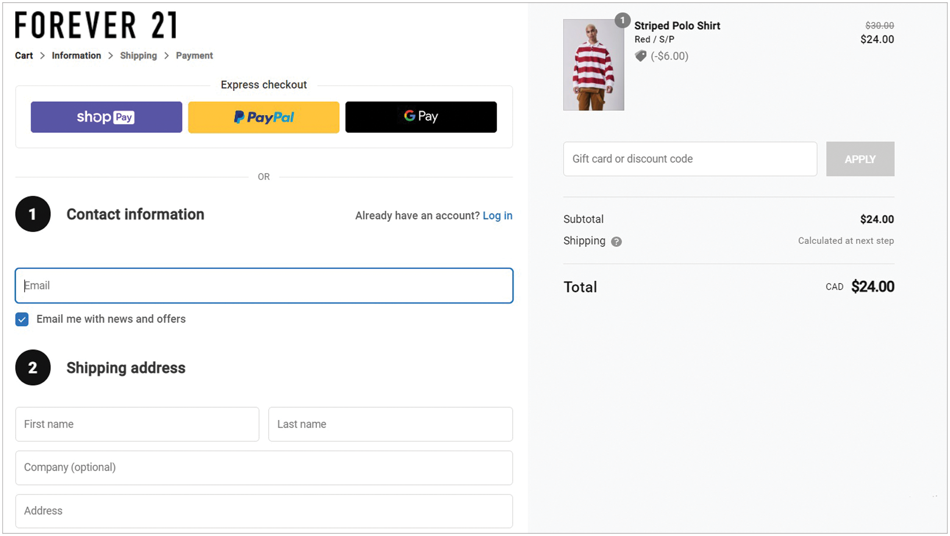
Cart and checkout
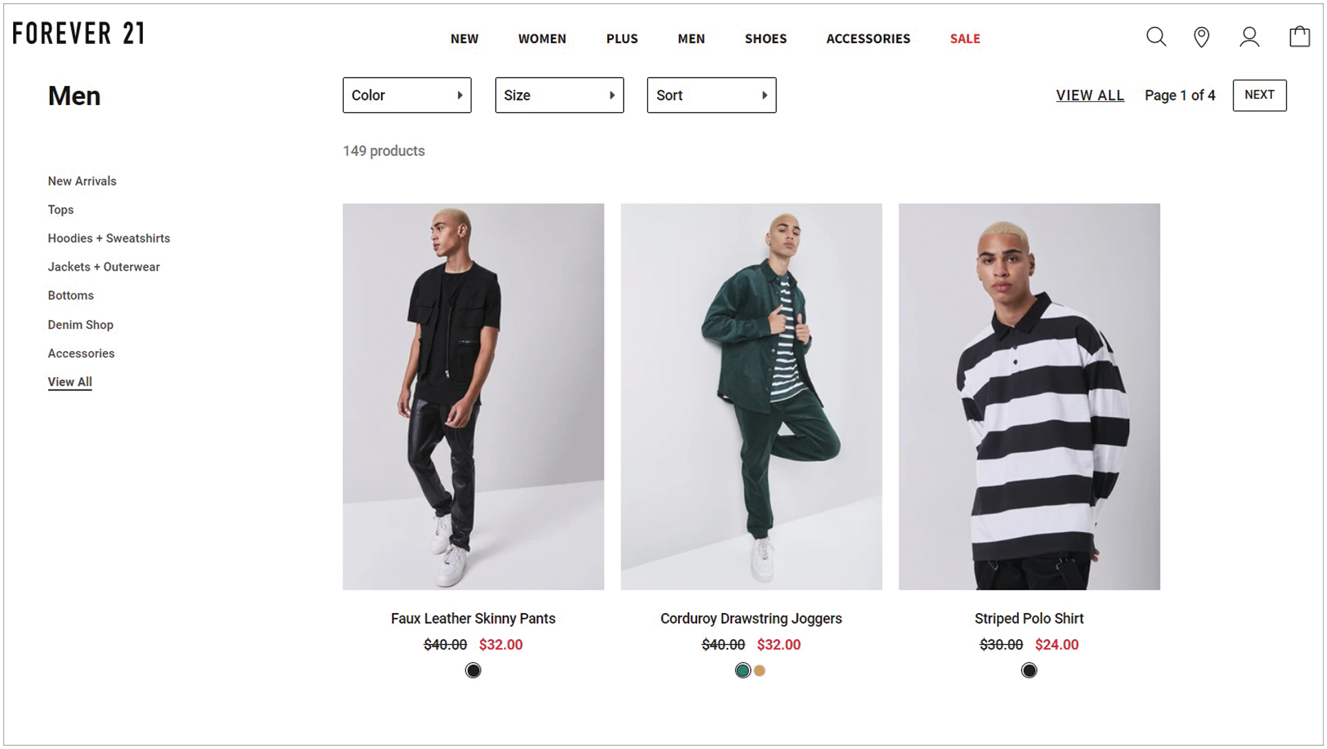
Gallery
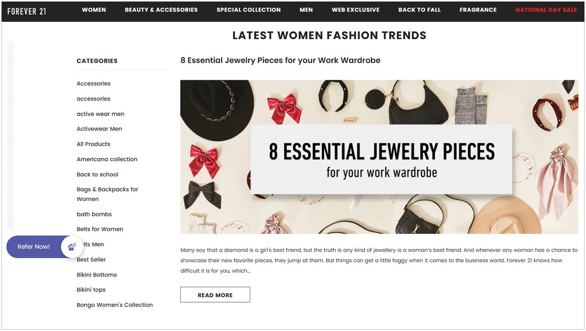
Blog
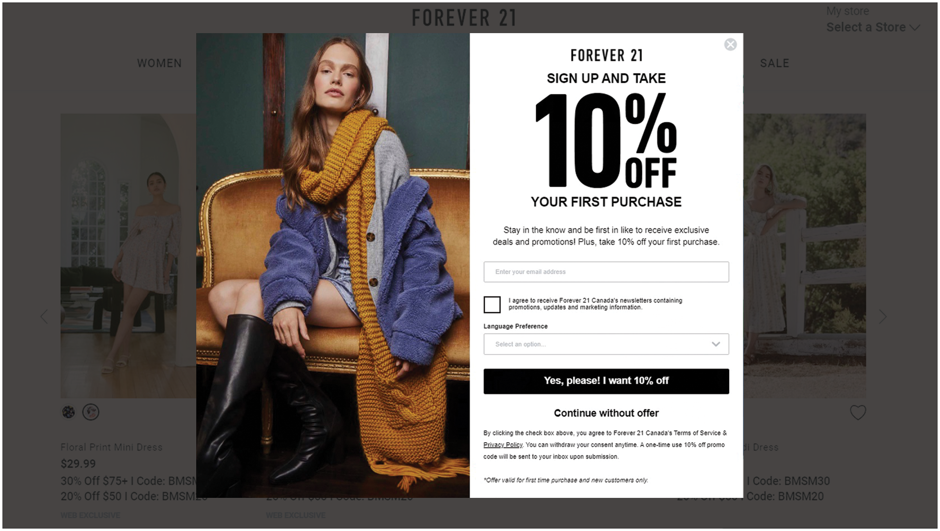
Subscription pop-ups
Google Maps
Social media share buttons
Contact forms
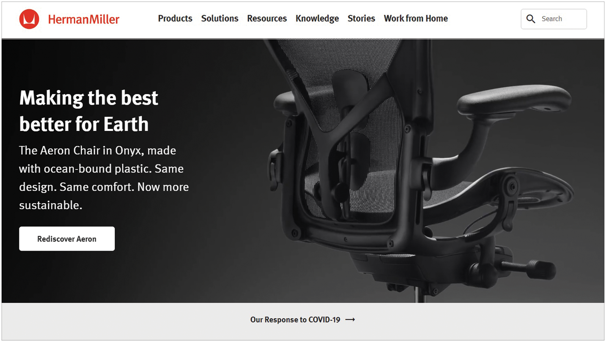
Use the right photos.
Overly cheesy or cliche photos
Obviously scripted photos with people flashing fake smiles and awkward poses
Popular and commonly used photos
Drop a strong Call to Action.
Use complementary colors on the CTA button to attract attention to it.
Don’t beat around the bush and be direct to the point.
Avoid putting more than one CTA button on a page to steer away from confusion.
Be mobile-friendly.
Let’s think of creating a web design like building a house from the ground up. Think of this first step as the research and blueprinting of the house.
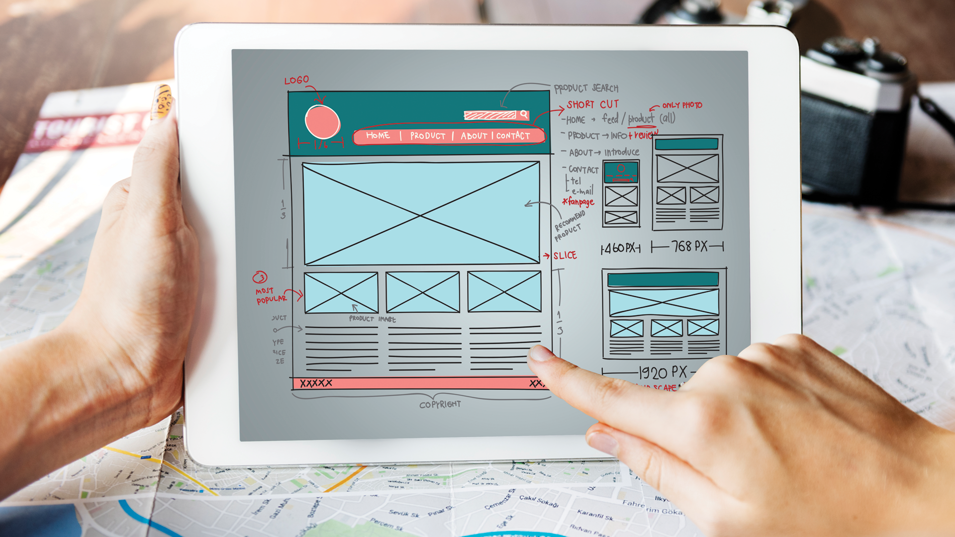
Here’s a quick checklist of things you need to list down when creating a web design:


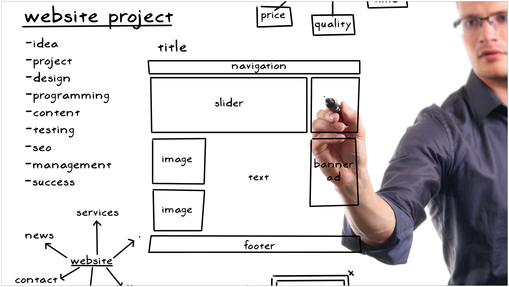
Having a clear outline of what pages are going to look like and the flow of each process on the website will help keep you in line while going through the rest of the steps. Draw it out on a piece of paper or use apps like Figma (free version) or Sketch on Mac to create a visual interpretation of your ideas and plans.
To give your website some integrity, clear branding must be applied to your web design through visual aspects in the layout.

Consistency and clarity on your brand personality offer consumers something they can connect with. This also gives your viewers a peek at your style and approach to the business, assuring them even more of your ethics as a merchant.
To create clear branding here are some points to appraise:
Brand-driven marketing can be highlighted in your branding approach to amp up the effectiveness of the visual aspects of the web design.
You can, for instance, use warm color palettes and less stiff fonts while promoting a family-centered business.
A combo of a clear understanding of your business and an exhibition of how that plays into the lives of your consumers creates a strong emotional connection that people need when committing to a sale.

Visual clutter takes away your viewers’ attention to the important things on your website. Overhaul your website from all these distractions and aim for a cleaner layout on your designs. Save your users the headache of trying to make sense of a busy page and help them see items that matter.
Opt for photos, logos, or icons versus gifs or moving items on your page as they serve the same purpose without being a distraction. Too many and unnecessary animations and interactions can raise a few eyebrows and can easily get confusing.
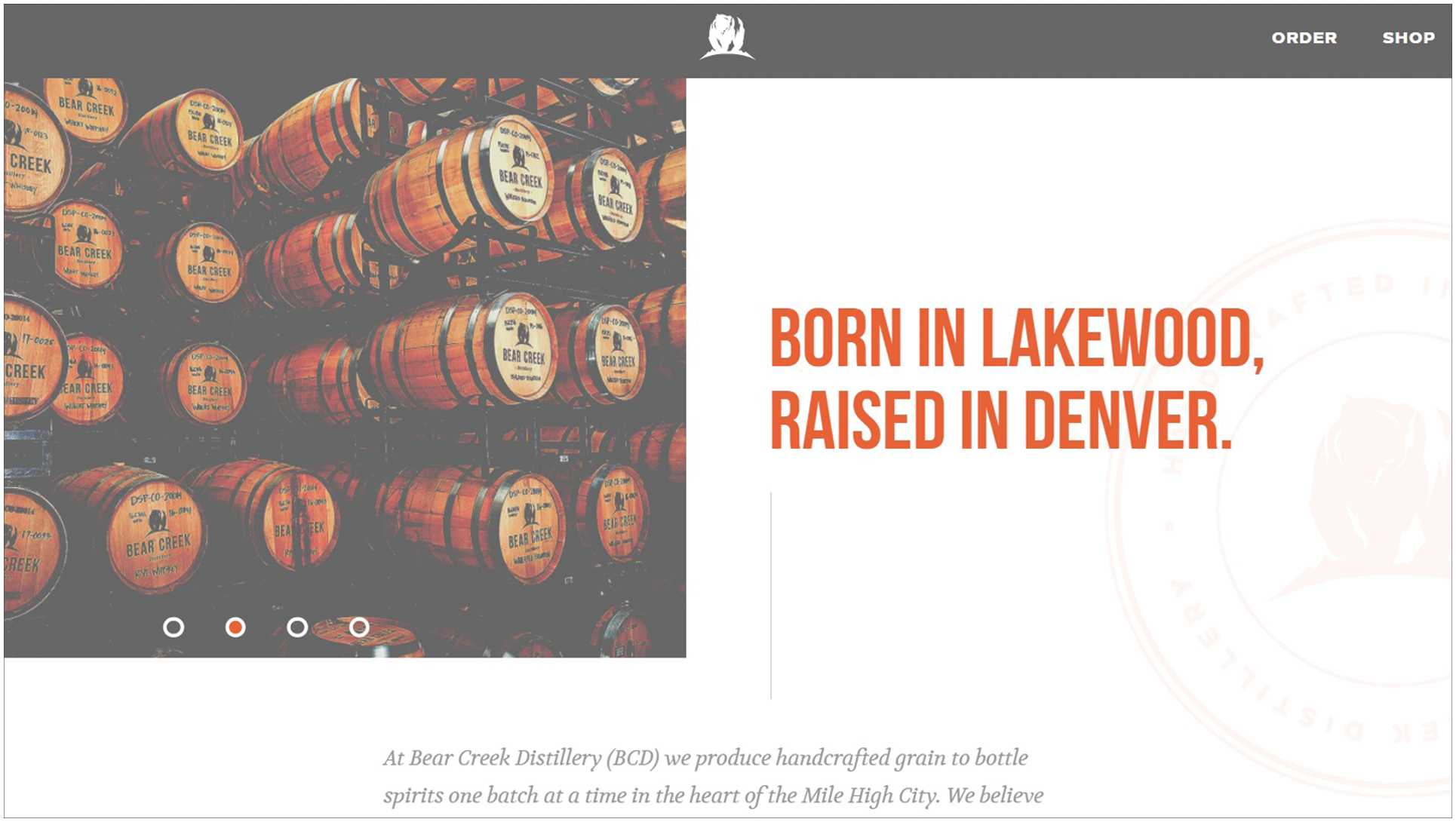
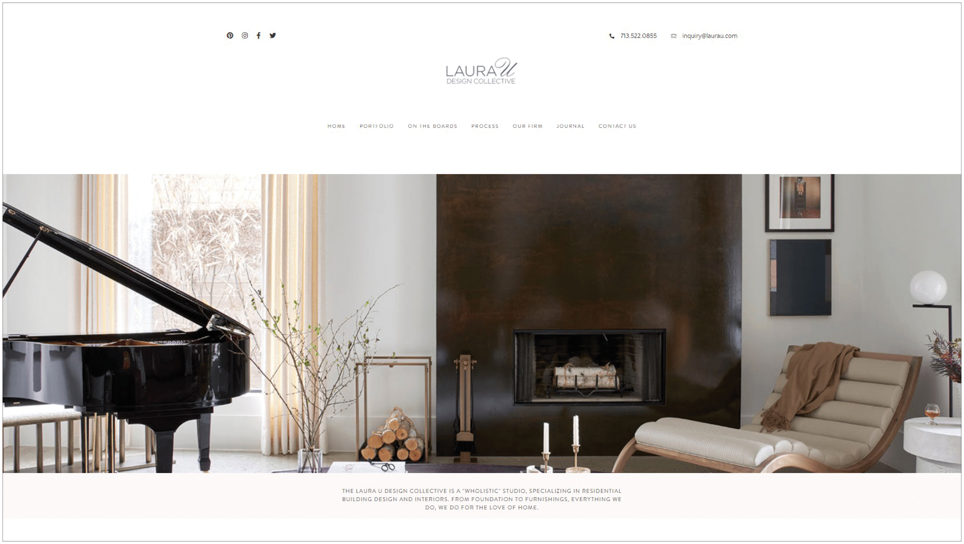
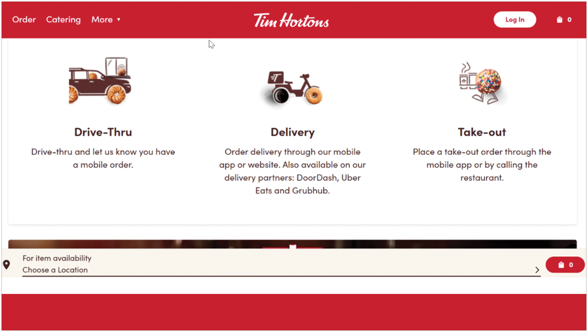
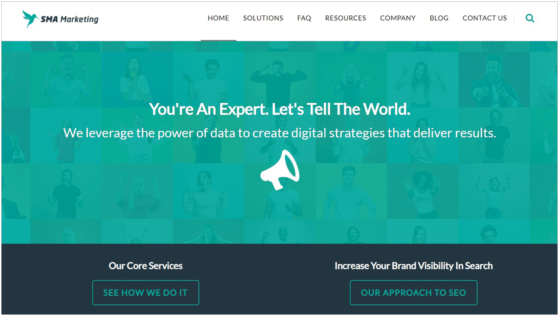
Find a balance between a minimalistic approach and points of interest without losing functionality and visual appeal. Simple is better applied in this branch of your web design as you want ease-of-use on your page to get better traffic. Like Tim Horton’s simple and straightforward page.
One of the pillars to a successful website is choosing the best web structure that works for your users.
Web structures make your website comprehensible for anyone who uses it. Simply put, it’s choosing which method to use to organize the site contents through information architecture and design layout.
A pretty website that’s hard to understand is not going to do your business any good. Therefore, start with figuring out the architectural structure that befits your users.
In this, you can go with either top-bottom or bottom-up approach.
Once you got that down, the next step is deciding on which type of web structure fits your business and intent for the website.
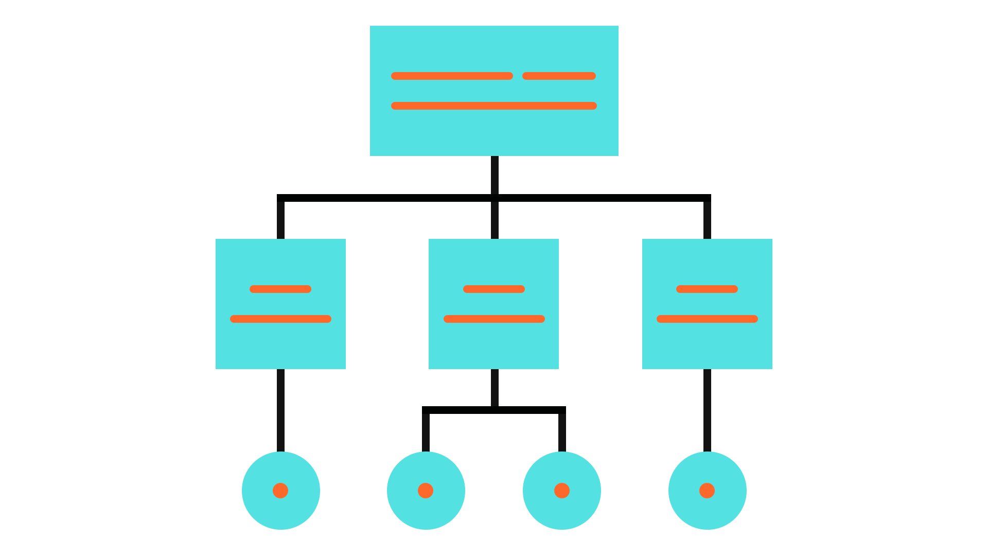
This model is the most common and most often used by designers for web apps that have massive data — making it hard for users to sift through. To make it easier, content is lumped into categories and then into sub-categories (if necessary) before finally getting to a detailed individual page.
As the name entails, this model comes in a sequence that guides the users through a step-by-step process. This is popular when brands require creating a new account upon the visit or when onboarding is required.
It’s the most unique and non-traditional of the models, as well as being the oldest structure used. In this structure, users can decide where on the website they want to be taken. With this style, searching or using internal links is the best way to go.
For clients that are heavy on data, this model is usually utilized as its dynamic capacity allows for high usability despite large amounts of content. This style requires a well-built information architecture and strict application of taxonomic best practices.

At the end of the day, keeping your users in mind and how to best showcase your content while assuring the highest ease-of-use and shortest learning curve should be the primary goal. So put yourself in their shoes and pick a user-friendly structure to make it functional as it is visually engaging.

Convincing a visitor to buy or subscribe to your services might not be as easy as that. To help tip them in the right direction, a bit of show and tell is necessary.
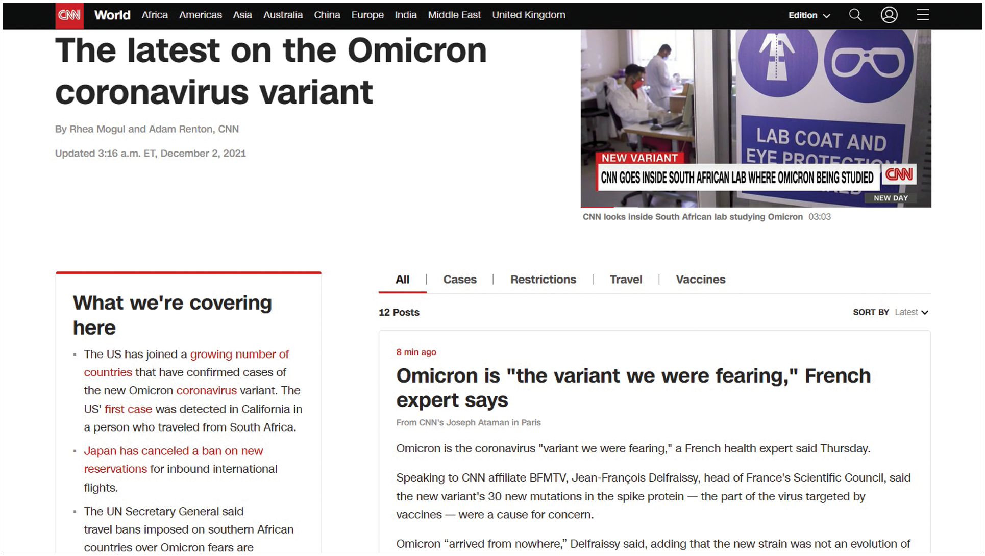
If you’re just starting, there won’t be much word of mouth yet to get you the boost you need. In this case, the next best thing is to have testimonials and commendations from previous and current customers to vouch for the brand’s quality.
Add a page that showcases your credibility. Be it a list of previous companies or big names you’ve worked with or social media shares and comments, these will help dust off potential customers’ uncertainties.
For a more upgraded testimonial page, you can:
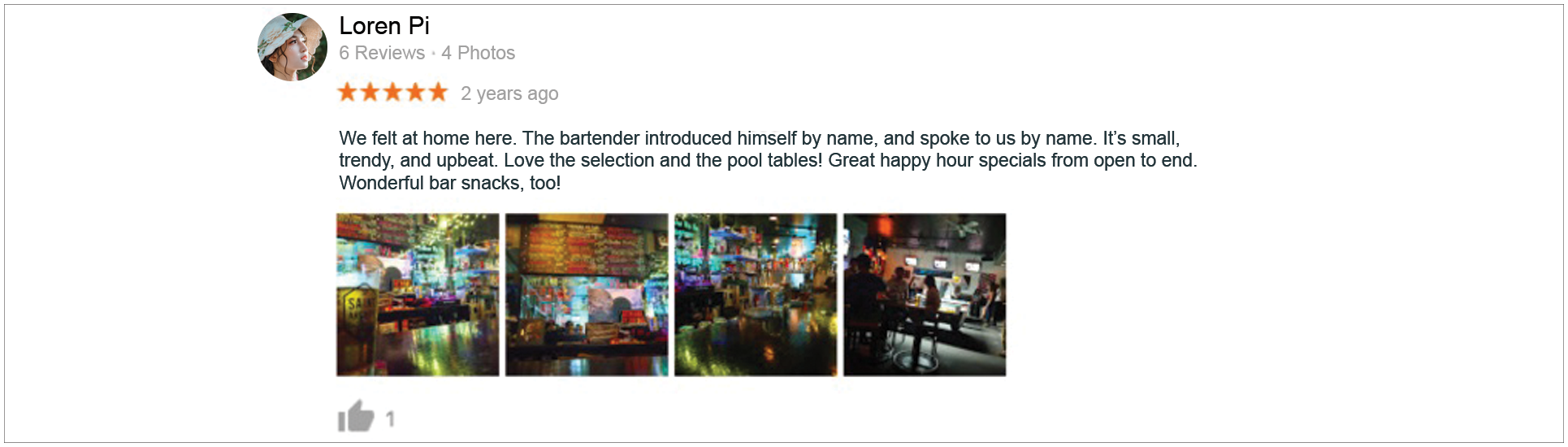

Here’s how a website highlighted its quality through a testimonial page with credentials from trusted names.
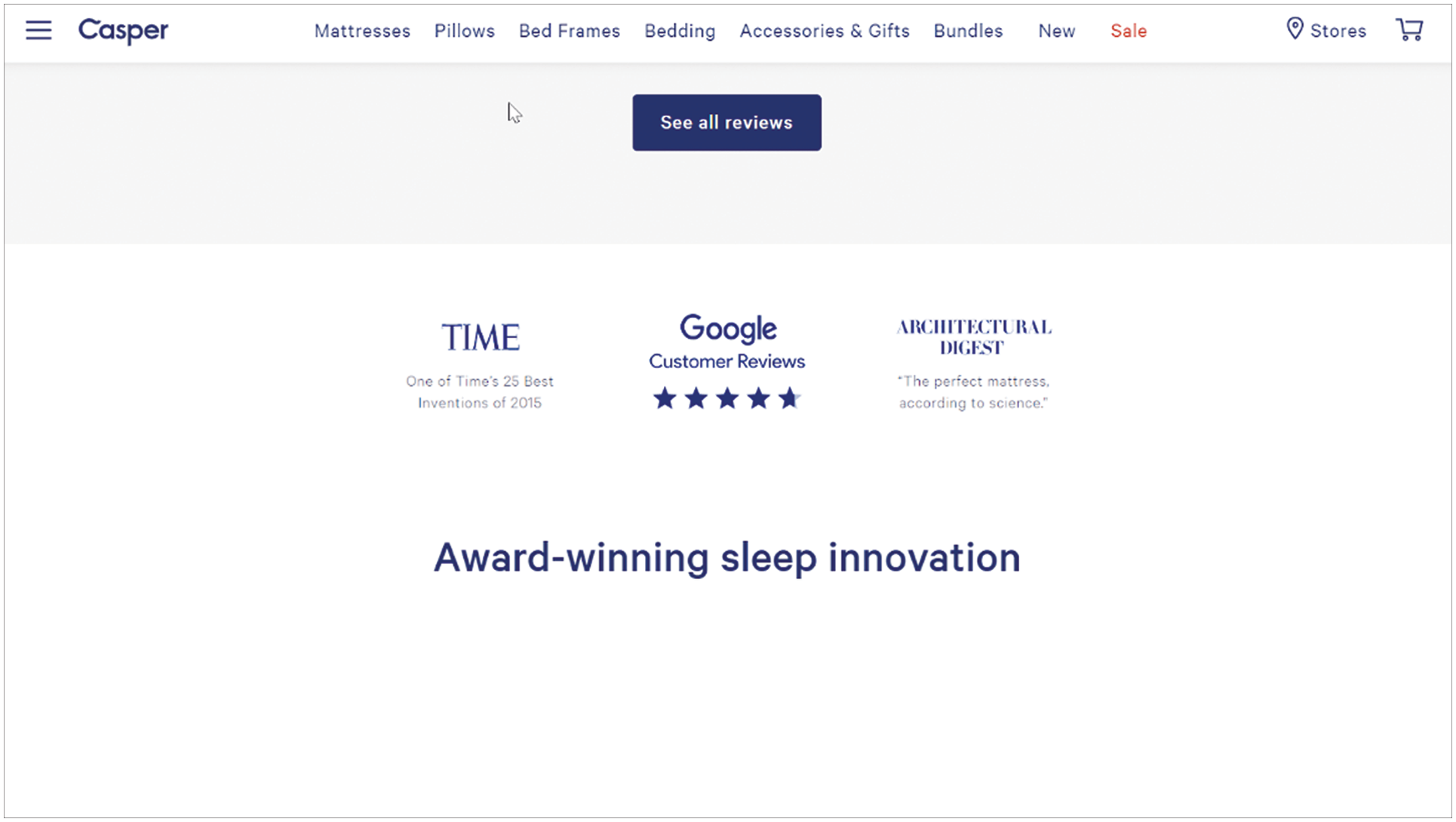
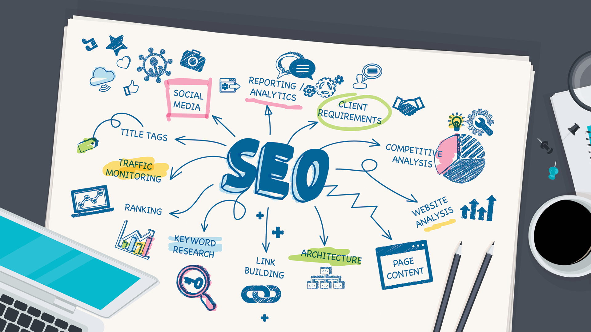
A polished web design also has to contribute to the success of the business. And thus, SEO-proofing your website is also a requisite.
Here are some sections of your website that might need some revamping:
Your homepage is the first thing users will see when they visit your website. It should be presentable and functional in giving them a birds eye view of your whole operation.
To optimize your homepage for SEO:
SEO logic: High readability boosts ranking.
SEO logic: Tags help search engine crawlers find your pictures
Fonts also play a huge part in amping your SEO standing. Just by applying the proper text styles on your headers and sub-texts, you’re already doing your website a favor in the SEO department of your business.
The goal is to get recognized by the search engines by using H1 for main titles and H2 for subtitles on your content.

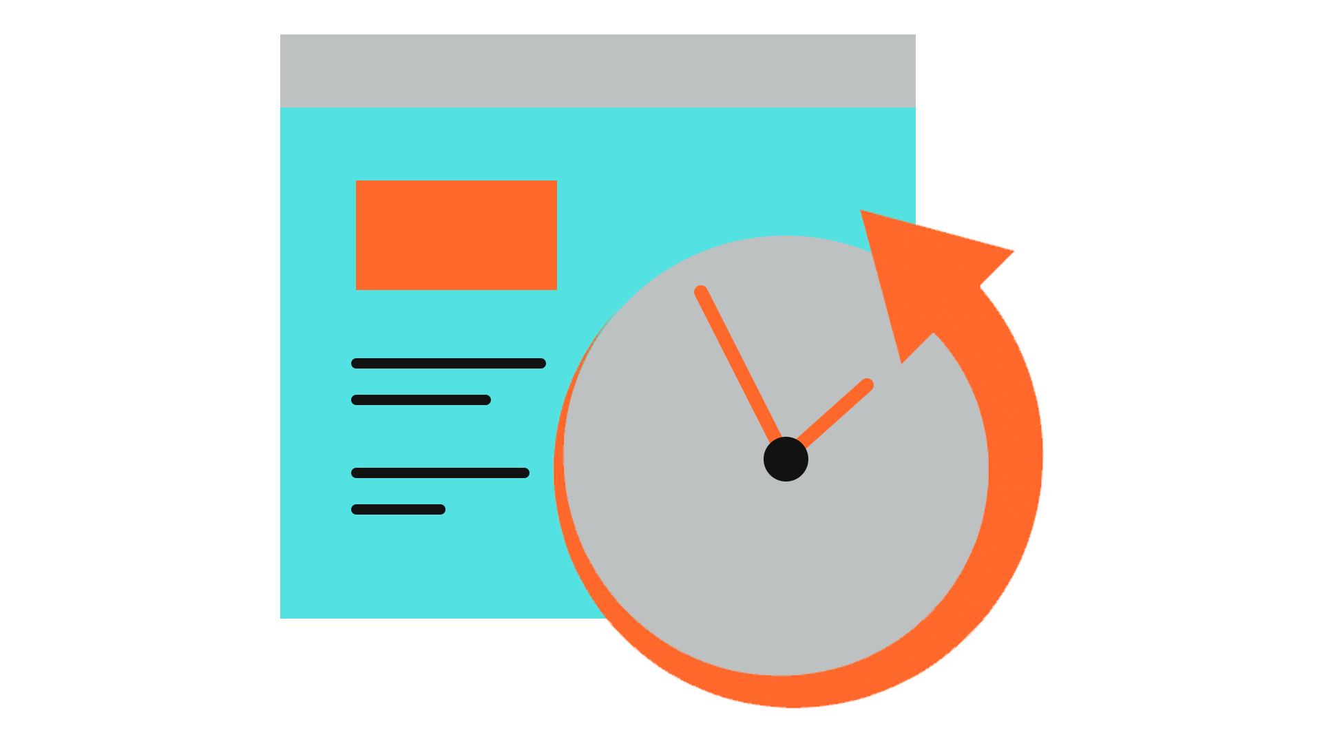
Don’t you just hate when you try to open a site and get greeted by a 404 error? Broken links from your home page or any page for that matter break the momentum of your customer’s user experience. Therefore, you don’t want them to end up in dead links. Get regular cleanups to ensure smooth surfing for users. Web developing services — such as Anindote, offer regular and constant maintenance and monitoring of your website to keep your site in tiptop shape.

Build better value for your brand by adding useful features that make life easier for your consumers. This will keep them coming back and encourage them to visit more often — which is the main objective.
There are many ways to make your website more valuable to your users and customers, depending on what sort of business you run. Always keep your customers in mind when thinking up additional features
Here are some ideas to get you started:
Get personal with your customers with messaging and chat apps. Open a channel where your audience can reach you with their questions, concerns, or feedback.
For e-commerce websites, having a cart feature is a must-have. A smooth checkout feature that can save previous info (to save customers from typing the same thing over and over) and credit card details can also be helpful. Go the extra mile and set up one-click purchases to skip all the tedious parts of online shopping.
A substantial gallery that showcases the products or services is a thoughtful feature that considers the customers’ need to understand and see for themselves what they’re signing up for when they buy or subscribe.
Another way to exhibit your products and services is by posting blogs with more information. This can also be a medium to plug how your brand can contribute to their lives and make it better or more convenient.
Pop-ups used appropriately and at the right time can be handy for both the users and the business. Choosing the most optimal page for email subscription signups to pop up can make it convenient for users to enlist without losing the page they’re at.
Offering Google Maps to pinpoint the exact location of your store is also a nifty feature to add to your website. For multi-branched businesses, this becomes even more useful so users can check out which ones are closest to them.
Make it easier for users to share pages from your website by having social media share buttons available on relevant pages. Having the most widely used platforms should be enough to keep your users happy.
As an extended customer service, giving customers all the means to contact your company is the best show of openness and transparency. Not only will it increase your user experience but your customer loyalty, as well.
In creating a visually appealing web design, photos are a staple.
But that isn’t to say that just any photo will do. To create exceptional pages, you have to pick and choose the photos you embed with consideration.
The best way to go about it is to take original photos by your team or company. This assures the authenticity of the images you use on the website. It also is most likely going to play closer to your image and branding versus stock photos since you or your team can control the vibe and treatment of the photographs.
If this isn’t possible for you right now, then stock photos are the way to go. Using stock photos can be time and budget-efficient as most stock photos are either free or cheap. The paramount rule in choosing which one to use is to always stick to your brand image.
Professional branding calls for sophisticated and official-looking photos. So if you’re a furniture brand, pick photos that highlight furniture backdropped by a well-designed interior.
Some things you should avoid when using stock photos are:
A Call to Action (CTA) is, as the word implies, what you want the customers to do. A CTA is an essential item on your web design as it drives the sales and thus, the effectiveness of your website.
Strategize how your Call to Action can be most efficient by planning out where, when, and how to place it.
Put yourselves in your customers’ shoes and add a CTA where it’s most needed. For instance, placing a “Buy Now” on the page listing page can be compelling since the customer might just be on the verge of buying.
Where you place the Call to Action is also vital in its usefulness. Put it in typical areas where users would expect it to appear. Typically, CTAs are found on the top right of the page for things like “Sign Up”, while CTAs that lean towards “Ask for a Quote” or “Contact Us” are at the bottom of content or sections on a page.
Another definitive factor that should be taken note of about a Call to Action is its visibility. Here are some things to remember when planning out how to create an effective Call to Action:
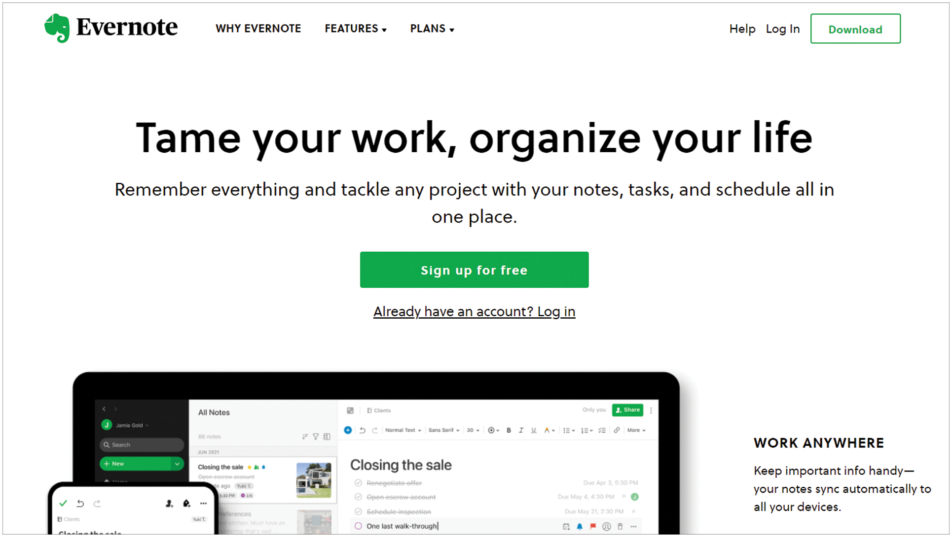
Here’s an example of Evernote using complementing colors and white space to make its Call to Action stand out. Despite having two CTAs on one page, the hierarchy is clear and the user’s eyes are drawn to the most urgent of the two.
Who isn’t on mobile these days? Hence, a responsive interface isn’t an option but is essential for any website that’s worth mentioning.
You want your website to be ready for your on-the-go audiences that generally use their phones for searching and shopping. Be it on small screens (mobile phones) or bigger ones (high-res screens), prep your website for the best viewing experience for users.
A familiar but mobile-optimized page is ideal for maintaining positive UX and ease of use. Not only will it encourage more patrons to visit and check out your website, but a highly responsive website can also generate higher rankings on the SEO, making it more visible.
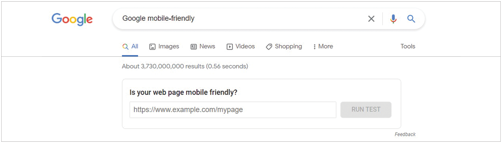
You can check out how mobile-ready your website is with the Google Mobile-Friendly testing tool which will also give you an overview of the points you might need to work on.
Fortunately, most web hosting services offer responsive pages. But should you want to step it up a notch, you also have the option to get with web dev services that can create different viewing platforms for your website.
Wrapping it up

So to round everything up, here are the ways you can improve your web design as a newbie designer:
Map out a draft.
Maintain consistent and clear branding.
Remove clutter.
Choose the best structure.
Exhibit social validation.
SEO-proof your website.
Add useful features.
Use the right photos.
Drop a strong Call to Action.
Be mobile-friendly.
Looking to improve your website is a good direction in keeping your brand relevant in the tumult of competition. With the application of these tips, an upgrade on your website’s overall performance is bound to bear fruit.
As a newbie web designer, you might need a helping hand to tide you over more challenging humps. Have ideas you want to apply on your website? We’re the team to partner with.